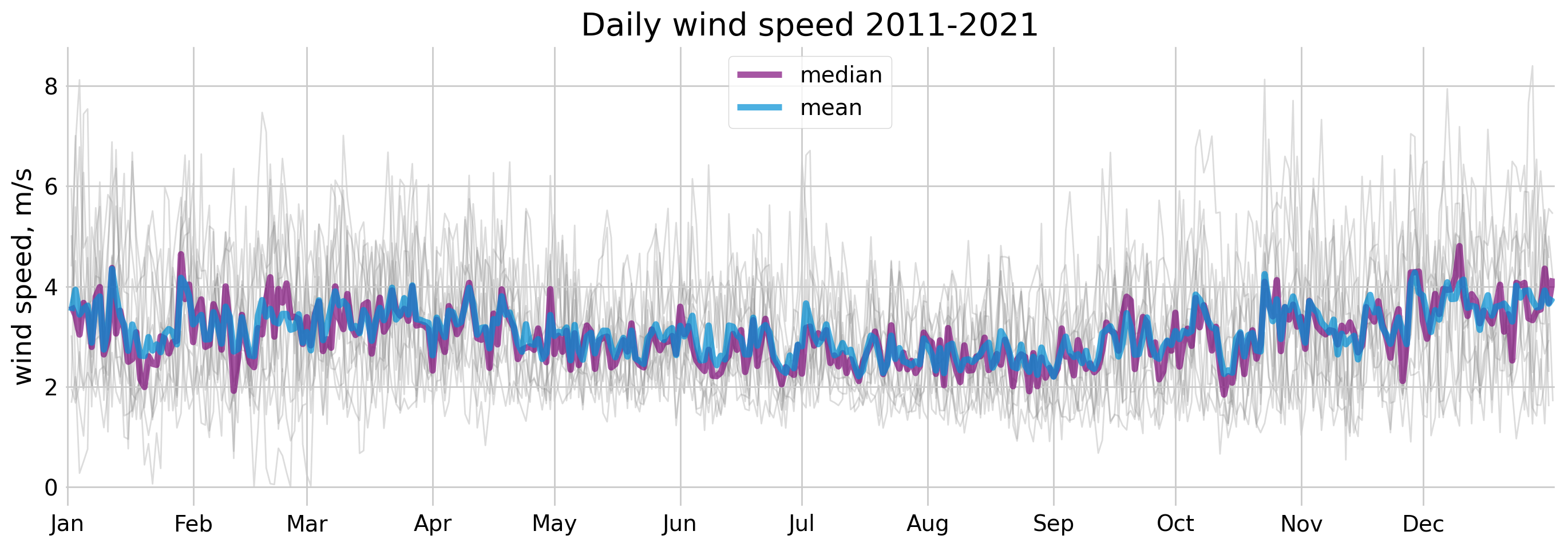
Is it me or it's always windy?
Comparing wind speed in spring 2022 to the historical daily mean from 2011–2021 to see if it's really been windier than usual.
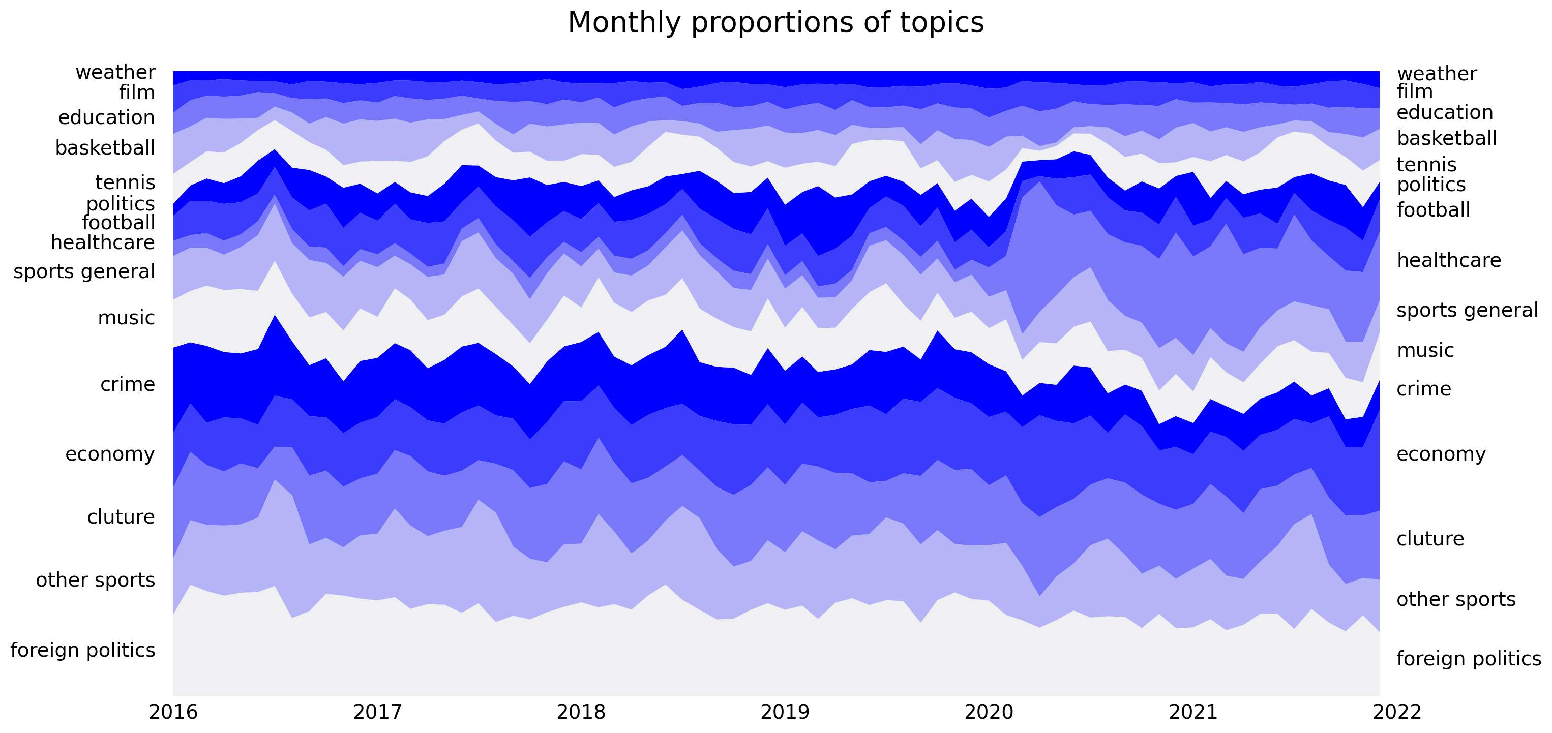
Topic modeling of news articles
Using topic modeling on Estonian news articles to see how coverage of topics like healthcare, economy, and sport has shifted.
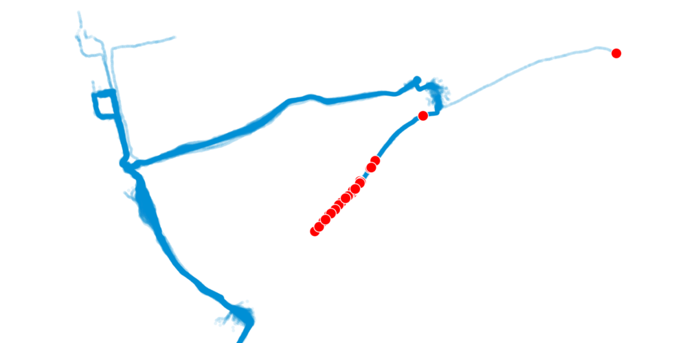
Timelapse of all my runs in 2021
Turning a year of GPS running data into an animated timelapse of routes run over the course of 2021.
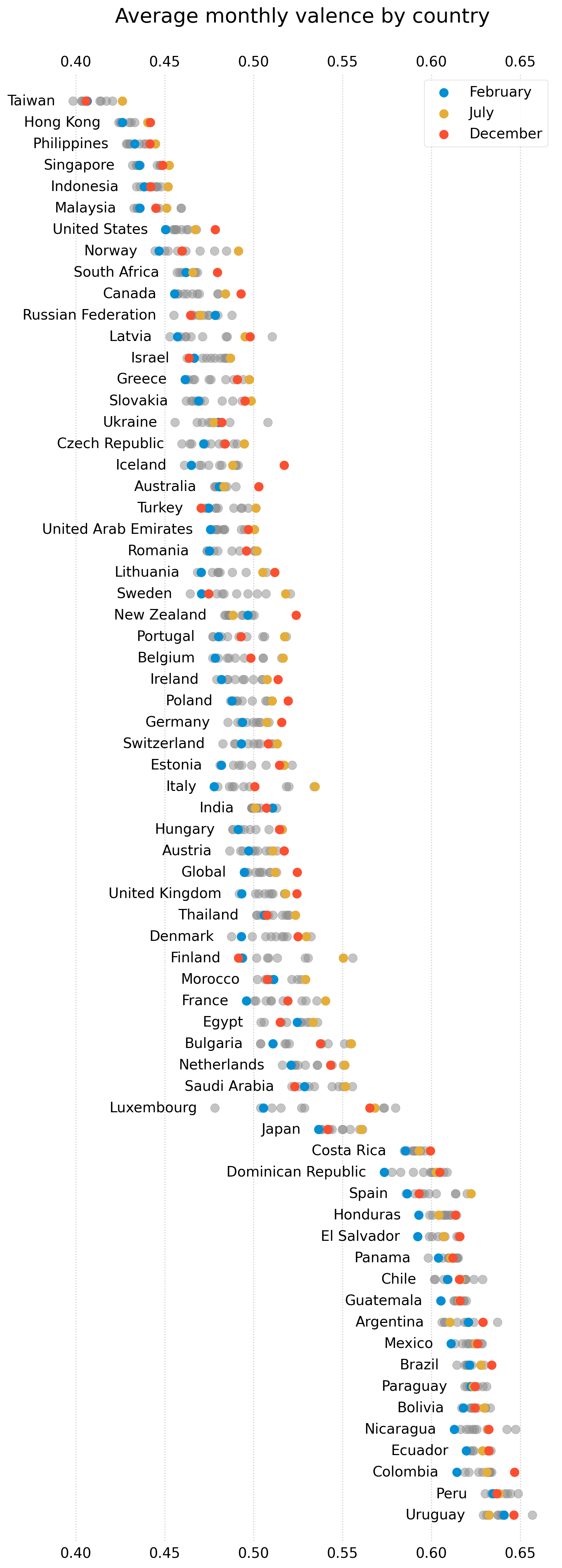
Mood of music streamed on Spotify
Looking at the valence (musical positiveness) of the most streamed songs in Estonia and the world over time.
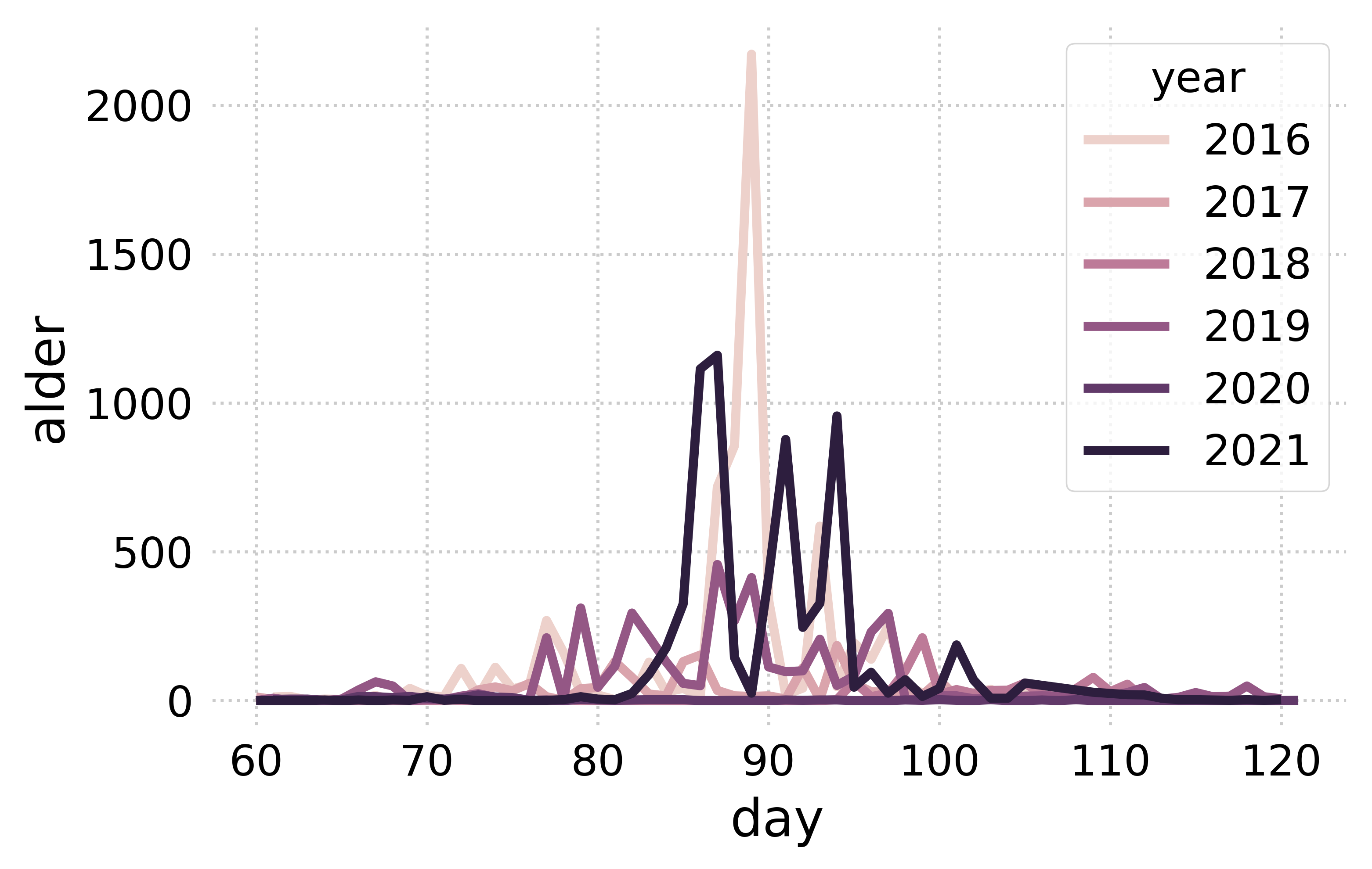
When is alder pollen the highest?
Modeling alder pollen levels from weather data to find when the pollen count typically peaks.
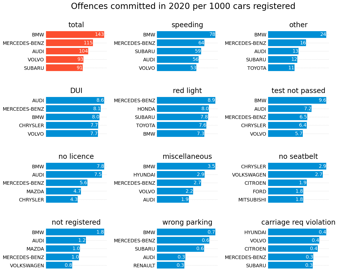
Are the stereotypes about BMW drivers true?
Testing common stereotypes about BMW drivers against real traffic offence and vehicle registration data.
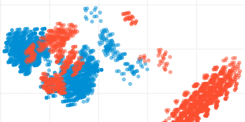
Classifying poisonous mushrooms
Comparing classification models to predict whether a mushroom is poisonous or edible.
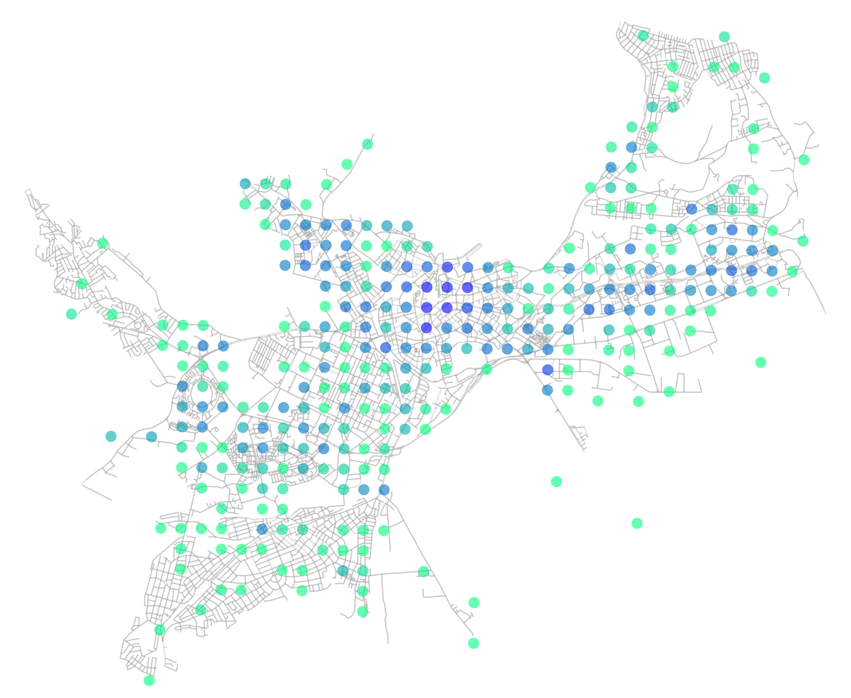
Where is the most likely place to have your phone stolen?
Looking at how the places and circumstances behind reported mobile phone theft have changed over time.
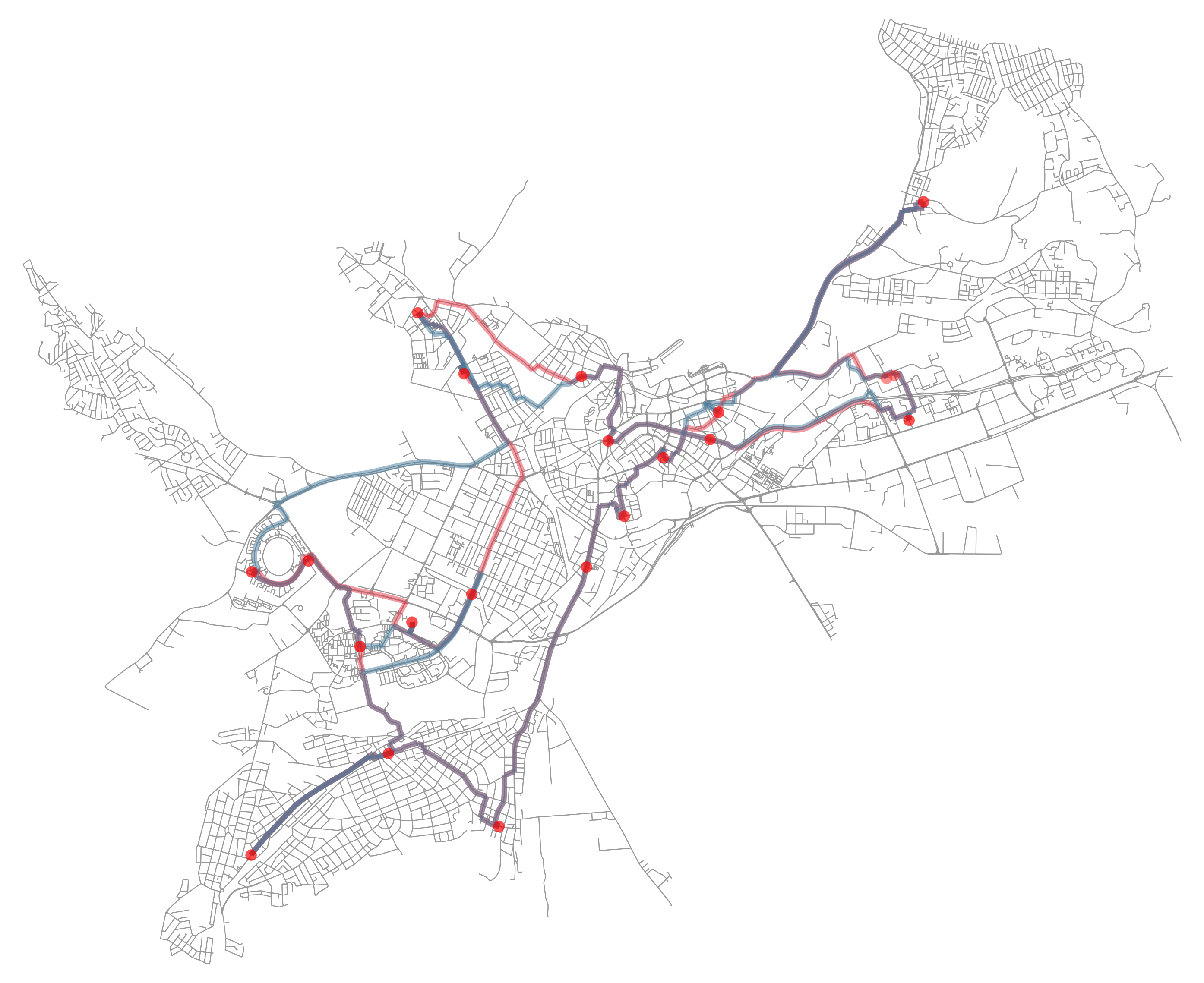
Most optimal route to visit all libraries
Calculating the most efficient driving and walking routes to visit every library in Tallinn.
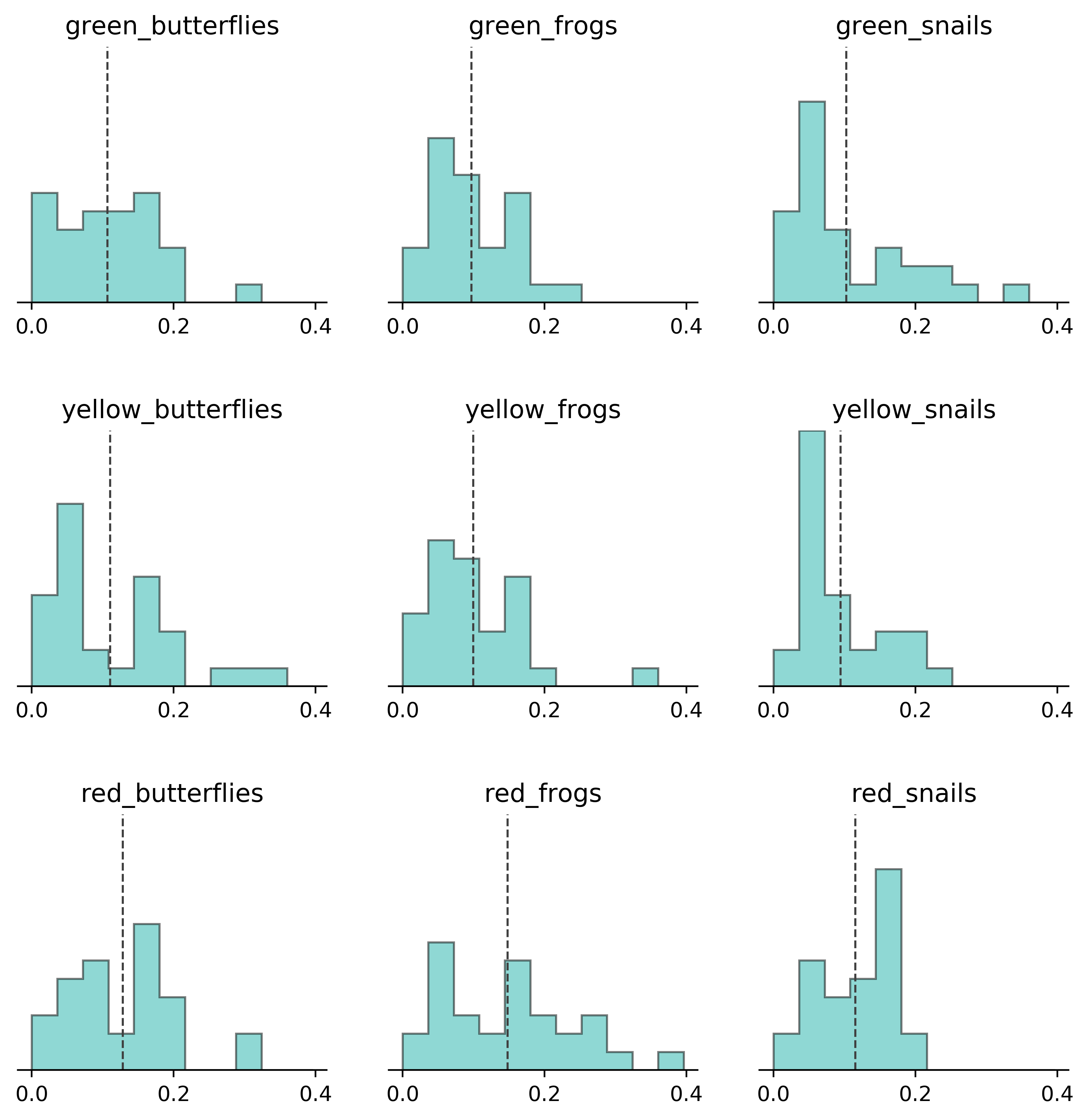
Hypothesis testing with Tutti Frutti
Testing whether Tutti Frutti candy colours and shapes are actually distributed evenly across packs.
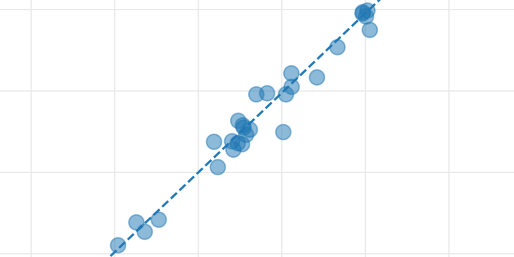
Am I a fast walker?
Comparing recorded walking speed against the average to see if I really do walk faster than most.
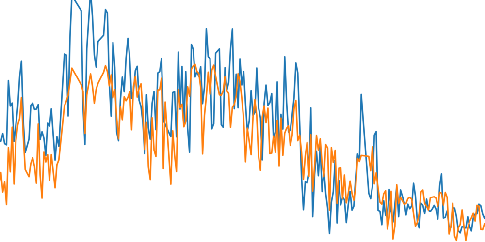
Predicting the number of cyclists and pedestrians
Using weather data and a regression model to predict daily cyclist and pedestrian counts at a Pirita sensor.
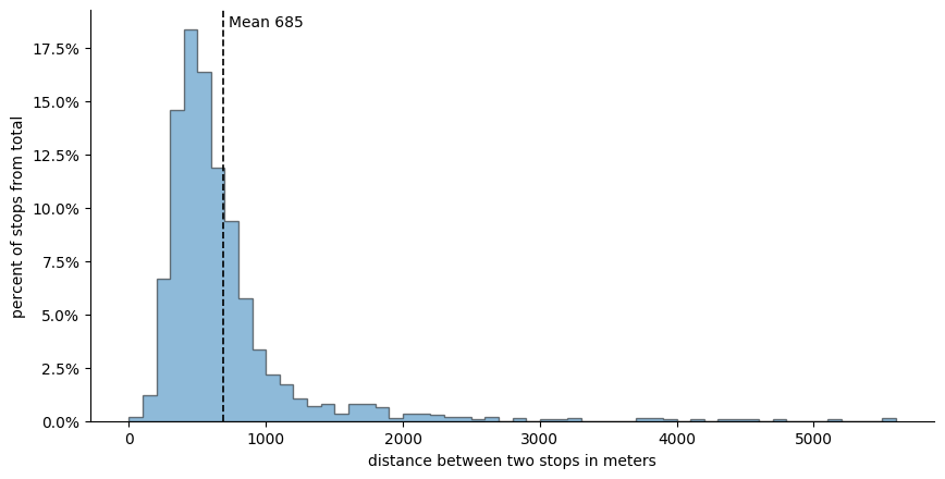
What is the average distance between bus stops in Tallinn?
Digging into the distances between bus, tram, and trolley stops across the city.
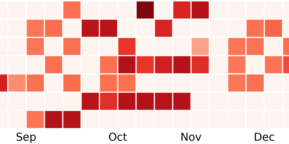
Visualizing a year's worth of running data
A look back at a year of running, visualized. (Write-up pending — see note on the page.)
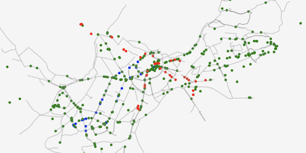
A day in the life of buses, trams and trolleys
A timelapse of live public transport positions across Tallinn over the course of a day.
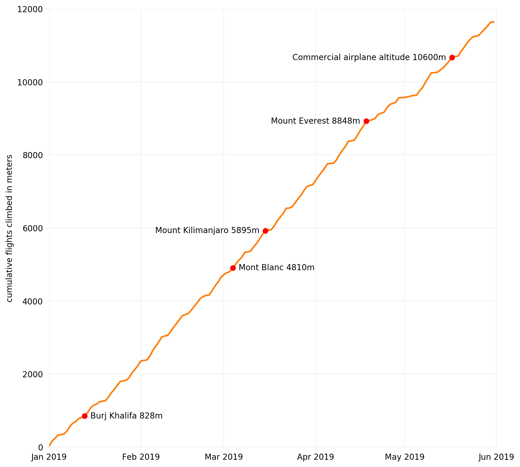
How high can you climb using stairs?
Using a phone's barometer data to track floors climbed and total altitude gained each day.
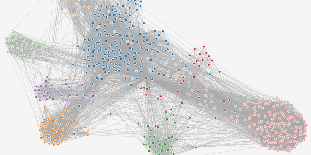
This is how my social network looks like
Visualizing a personal Facebook friend network and the distinct social clusters within it.
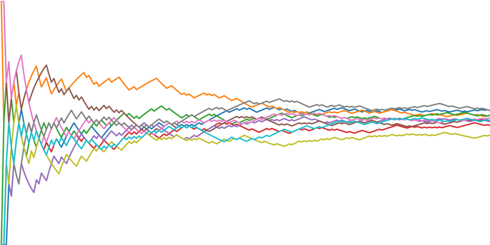
Proportion of heads and tails over time
Simulating coin flips to show how the heads/tails ratio stabilizes as the number of flips grows.

Inaugural addresses of presidents
Word clouds of recent U.S. presidential inaugural addresses to see how their main themes compare.